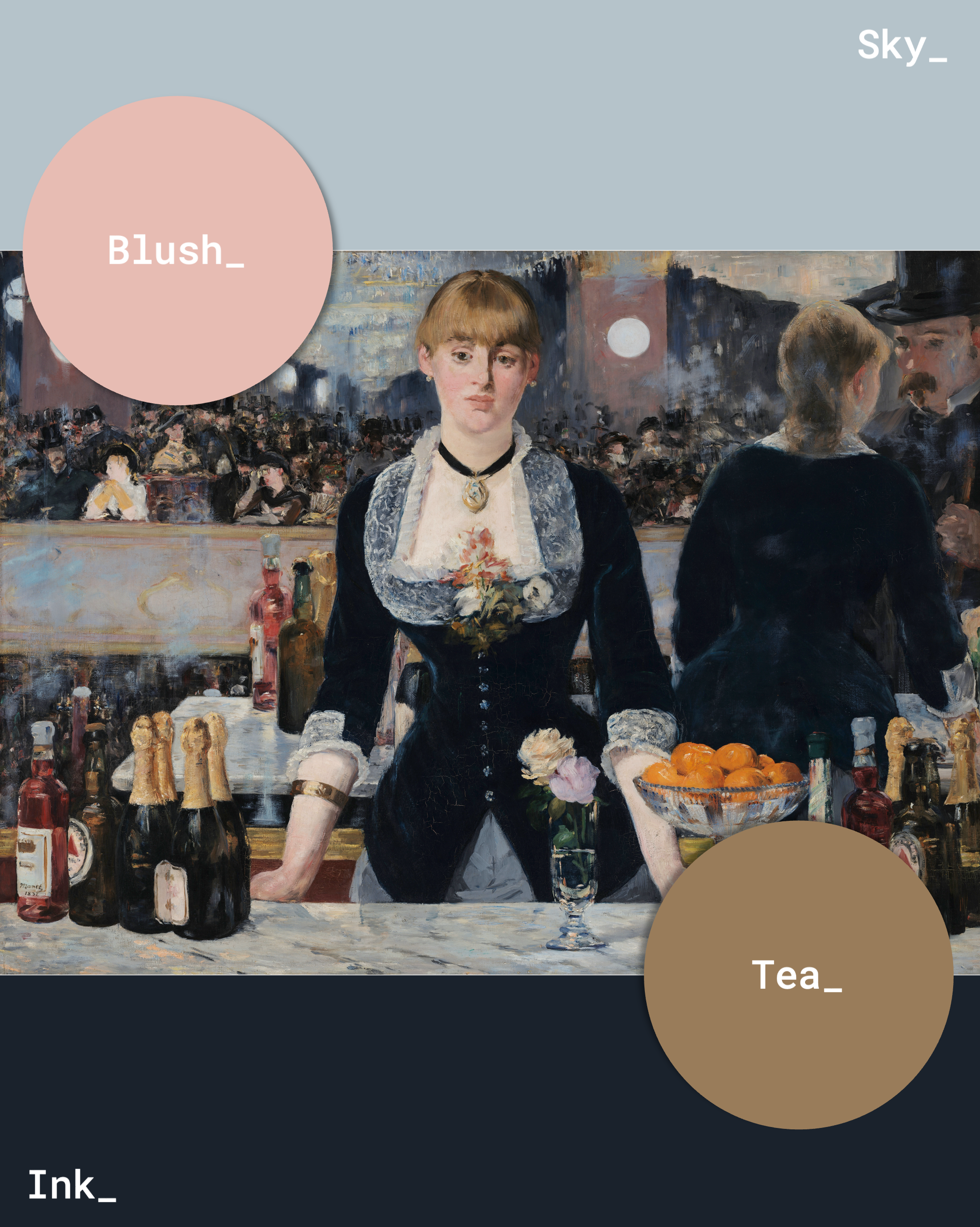
SLIDER

Rooms inspired by paintings: A Bar at the Folies-Bergère

Wednesday, 25 June 2025

Introducing a new series where I build an interior design scheme based around a painting!

I'm starting off with what might be my favourite painting of all time - A Bar at the Folies-Bergère by Édouard Manet. I had a lot of fun with this colour scheme because it's soft, sophisticated, and surprisingly contemporary.


A Bar at the Folies-Bergère was Manet's last major painting - finished a year before he died - and was exhibited in 1882 at the Salon in Paris. The Salon was an art exhibition that featured work by recent graduates of the Académie royale de peinture et de sculpture (Royal Academy of Painting and Sculpture). The very first exhibition was held in 1667 in the Palais-Royal, but from 1725 the exhibition moved to the Salon de Carré in the Louvre Palace (now the Louvre Museum).

Because the academy favoured traditional and conventional works and rejected anything that didn't adhere to their tastes, forward-thinking, avant-garde artists created Salon alternatives such as the Salon des Refusés (Salon of the Refused) and the Salon des Indépendants (Salon of Independents) to exhibit their work, which led to the decline of the Salon de Carré in the 1880s.

Felicien Myrbach-Rheinfeld's Candidates for Admission to the Paris Salon, late 19th–early 20th century. 

A Bar at the Folies-Bergère was considered controversial due to a number a reasons. 

The painting depicts a scene from modern society - the buzz of the Folies-Bergère, a music hall founded in 1869 famous for the mildly risqué content of its entertainments. Scenes of theatre life, recreational activities, Parisian cafés, anonymous passers-by, workers, and prostitutes were not well received by academics and critics of the time. It diverted from traditional topics such as history painting (classic mythology, biblical scenes etc.), portraiture (of royalty), genre painting, landscapes, and still life.

Even the bowl of oranges on the counter has a deeper meaning - in 19th-century Paris, oranges were often associated with courtesans, suggesting the availability of illicit pleasures at the Folies-Bergère.

Lastly, the composition is fascinating. The barmaid is looking at the viewer, but her reflection is off to the right. The perspective is completely misaligned. Many don't notice the mirror behind the barmaid (you can see the frame by the barmaid's wrists) reflecting the interior of the Folies-Bergère, including a balcony full of patrons watching a performance below, a majestic chandelier, and a male customer at the bar (where is he in our 'reality'? Is he us, the viewer? Is he Manet?)

So, here is the room I put together based on the colour scheme of A Bar at the Folies-Bergère...


(If a product isn't linked it's because it was probably a PNG from Google Images.)

The soft blush pink I eyedropped from the barmaid's cheeks to add a touch of femininity to the colour scheme. I really like blush and navy together, it's a fun and youthful combo that can work in any room in the home.

The framed Mackintosh art print from King & McGaw brings a pop of orange into the scheme, mirroring the bowl of oranges in the original painting. I used a marble texture as the worktop in reference to the bar, and the brass hardware was inspired by the foil closures on the champagne bottles. A fluted butler sink adds a touch of Art Nouveau glamour.

I'm quite happy with this design. It feels fresh, young, and glamorous.

Information: Britannica, My Modern Met, The Courtauld, Art UK, GalleryThane, DailyArt Magazine, ART in SOCIETY, and Artnet.

Colour of the season: Butter yellow

Sunday, 1 June 2025


Like the rest of the internet, I'm jumping on the butter yellow bandwagon. It just such a sweet, charming, joyous colour. How could you not love it? It's tamer than primary yellow, which means it can be worked into your wardrobe or home decor with ease. 

A pair of elegant shoes like the Harker slingbacks by Russell & Bromley would pair beautifully with a white broderie anglaise dress or a pair of light linen trousers. I especially love the 90s-inspired Outta Love sunglasses by Le Specs styled with chunky gold hoops and a denim jacket. A timeless trio.

To me, the striped tablecloth by The Newt in Somerset screams summer evenings spent in a fragrant English garden with a glass of something crisp and bubbly. And of course, you can't make a post about butter yellow without including a butter yellow butter dish, handmade and hand painted in Portugal. It's only right.

Please enjoy this selection of buttery goodness. Bon appetit!

Made from 75% BIRLA™ LIVAECO viscose, 15% linen, and 10% nylon.

Made from 100% Normandy flax. Temperature regulating and breathable.

Made from leather in Italy.

Made in Portugal from cotton and linen.

Made from 100% OCS certified organically grown cotton.

Made from sustainable organic cotton.

Made in Bulgaria from bovine leather sourced from Leather Working Group gold and silver audited tanneries.

Made in Turkey from 100% cotton.

Handmade in London from mulberry silk.

Handmade in Portugal from 100% earthenware.

Made from 100% linen.

Handmade from ceramic.

Made from 100% cashmere.

Made from 100% wood.

Made from ECOZEN® T110 - a BPA-free, phthalate-free, non-toxic, and recyclable bio co-polyester.
© Devotedly, Kate. • Theme by Maira G.